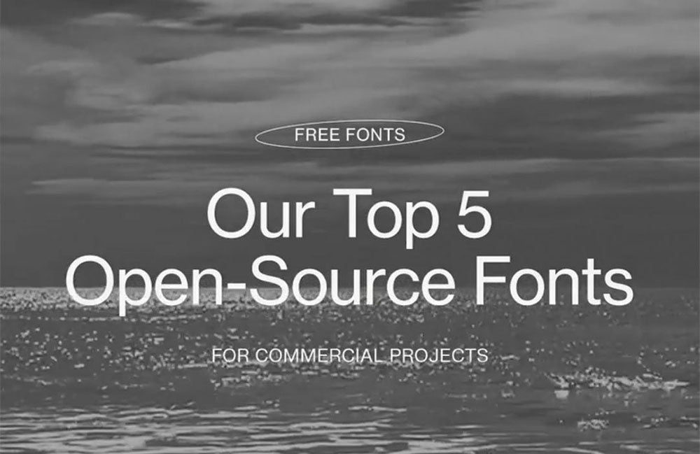

Our Favorite Open-Source Fonts, Vol. 001
Typography sets the tone long before a word is read. It signals intention, taste, and point of view. And while the design world often equates quality with exclusivity, some of the most thoughtful, expressive typefaces available today come from a different place entirely.
Open-Source Fonts have quietly reshaped how designers approach typography. They offer accessibility without sacrificing craft, and flexibility without visual compromise. For those of us who care deeply about design systems, brand identity, and editorial presence, open-source fonts can be powerful tools—when chosen intentionally.
This is not a roundup of generic free fonts. This is a curated selection for designers who care about nuance, character, and restraint. Consider this volume one of our ongoing exploration into type that feels considered, not templated.
Why Open-Source Fonts Matter in Design
Open-source fonts are exactly what they sound like: typefaces that are freely available to use, modify, and distribute. But their value goes far beyond cost.
For designers, Open-Source Fonts provide:
-
legal clarity across digital and print use
-
flexibility in branding and product design
-
longevity without licensing headaches
In a world where brands need to scale across platforms quickly, relying on fonts with restrictive licenses can become a liability. Open-source fonts remove that friction while still allowing for strong typographic expression.
And contrary to outdated assumptions, open-source doesn’t mean low quality. Many open-source fonts are developed by respected type designers and collectives with rigorous standards.
A Note on “Free Fonts” and Taste
Not all free fonts are created equal.
There’s a difference between truly open-source fonts and the kind of free fonts that flood download sites without thought for spacing, kerning, or real-world use. If you consider yourself even a little bit of a font snob, you’ve likely encountered this distinction firsthand.
The fonts we gravitate toward share a few qualities:
-
strong typographic structure
-
intentional imperfections
-
versatility across layouts
These are fonts that feel just as at home in editorial layouts as they do in brand identities.
Our Favorite Open-Source Fonts Right Now
Below are a few Open-Source Fonts we return to again and again—across branding, web design, and editorial projects.
|
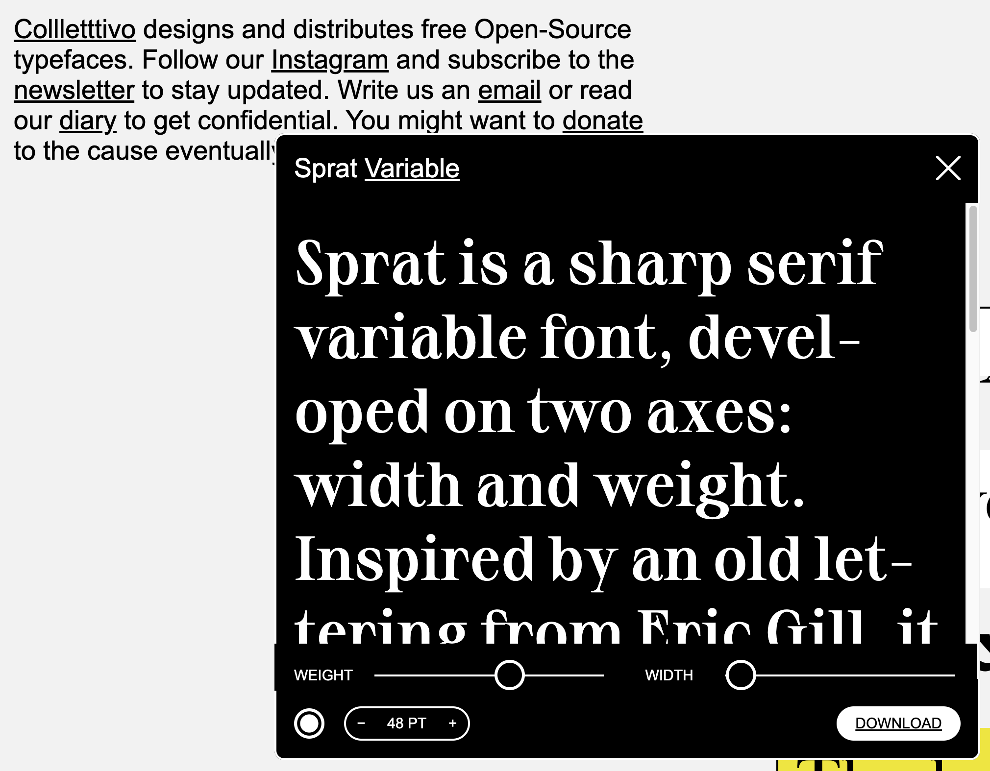
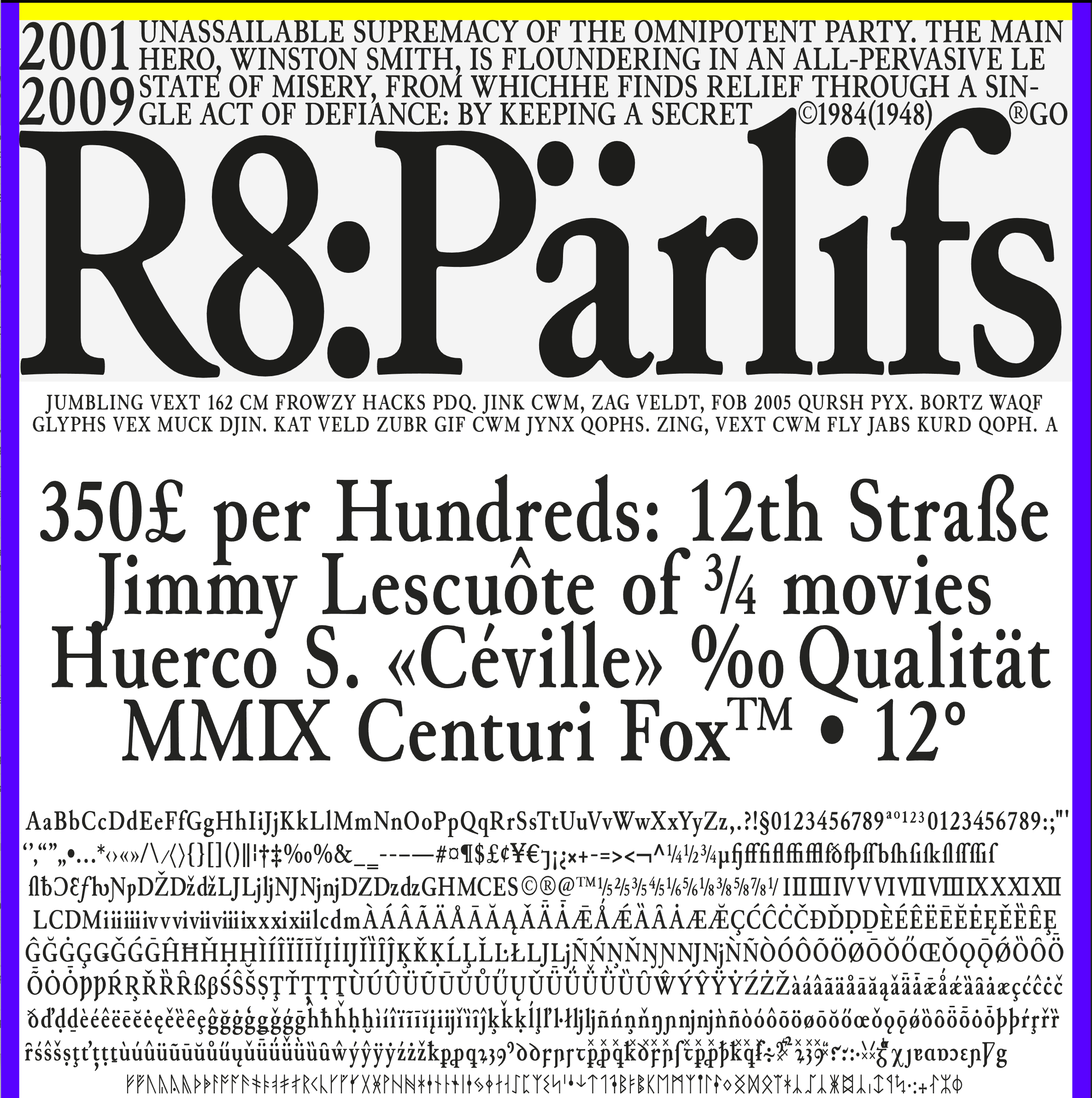
Collletttivo SpratInspired by an old lettering from Eric Gill, it features long sharps serifs, high contrast and round curves. |
 |
 |
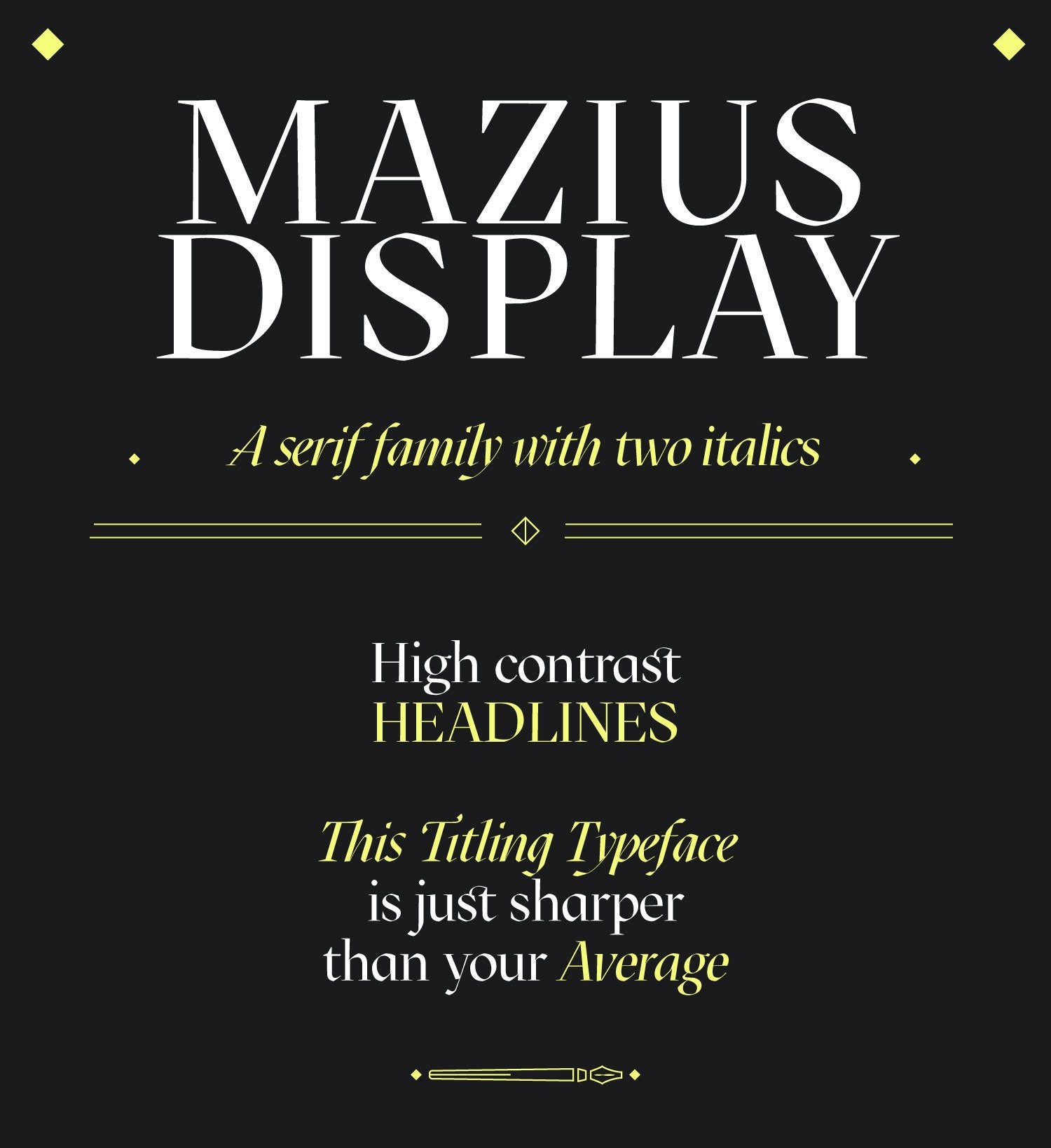
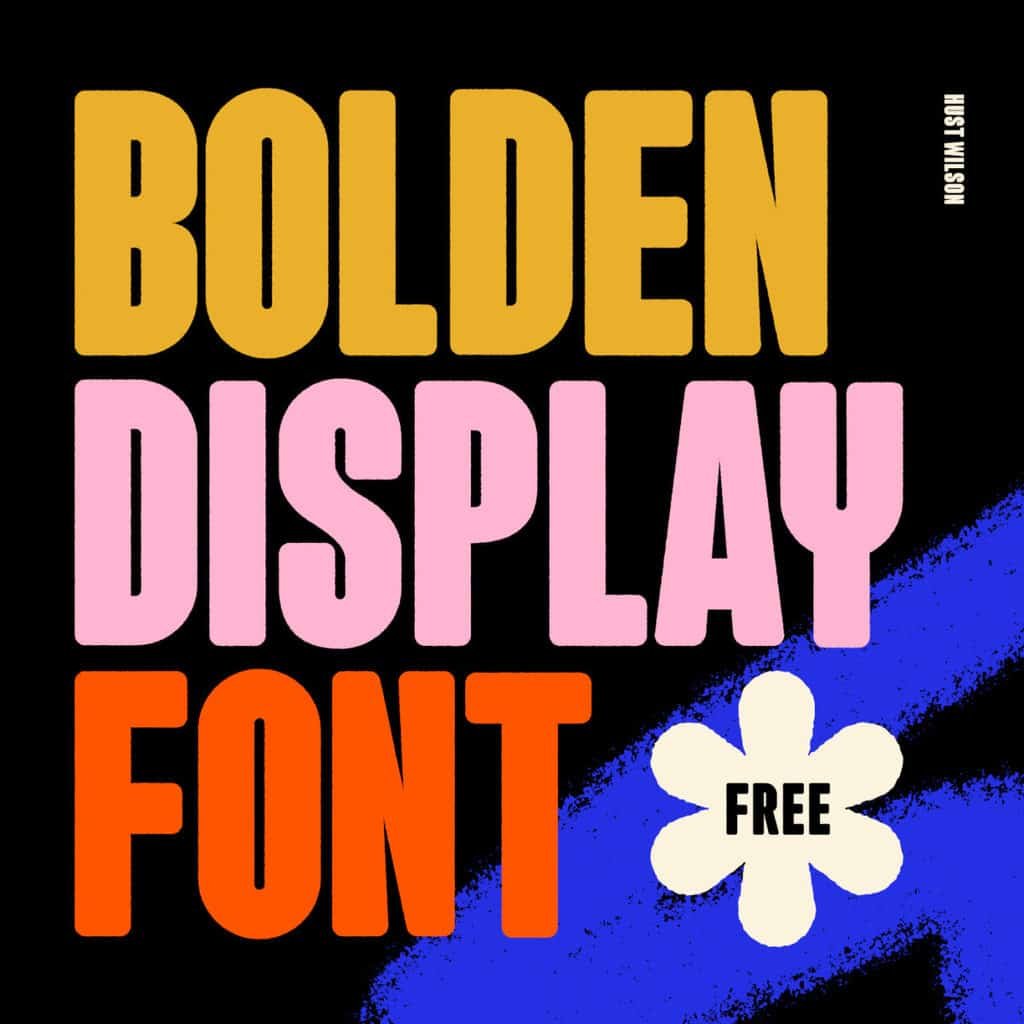
Collletttivo Mazius DisplayMazius Display is a serif typeface that doesn’t try to be quiet. It’s bold, expressive, and unapologetically stylized. As far as open-source fonts go, Mazius Display proves that accessibility and character are not mutually exclusive. This is the kind of font that works best when given space. Think large headlines, editorial spreads, or hero moments where typography is meant to be seen—not skimmed. DOWNLOAD MAZIUS DISPLAY FOR FREE |
Mazius Display: A Serif Typeface With Attitude
Mazius Display is a serif typeface that doesn’t try to be quiet.
It’s bold, expressive, and unapologetically stylized. As far as open-source fonts go, Mazius Display proves that accessibility and character are not mutually exclusive.
This is the kind of font that works best when given space. Think large headlines, editorial spreads, or hero moments where typography is meant to be seen—not skimmed.
Paired carefully with a restrained secondary typeface, it becomes a powerful branding tool.
Sprat Font: Subtle, Structured, and Editorial
Sprat is a serif typeface that leans more understated. It’s structured, readable, and quietly confident—qualities that make it especially useful in long-form content and editorial layouts.
Among open-source fonts, Sprat stands out for its balance. It doesn’t distract from content, but it elevates it. It’s a strong option for designers who want something classic without feeling dated.
Sprat works well across body copy, captions, and supporting text, making it a reliable foundation in larger design systems.
How We Use Open-Source Fonts in Practice
We don’t choose typefaces in isolation. Fonts live inside systems—paired with color, layout, and content.
When using Open-Source Fonts, we pay close attention to:
-
hierarchy and scale
-
pairing serif and sans-serif styles
-
legibility across devices
Open-source fonts allow us to prototype, iterate, and refine without worrying about licensing limitations as projects evolve.
They also make collaboration easier. Clients can access the same fonts without additional costs or legal ambiguity, which streamlines implementation across teams.
Open-Source Fonts and Brand Identity
Typography is one of the most immediate expressions of brand identity. Choosing open-source fonts doesn’t mean compromising on that expression—it means designing with intention and foresight.
A well-chosen open-source font can:
-
support long-term brand growth
-
simplify digital implementation
-
reduce friction across platforms
For brands that value clarity, longevity, and adaptability, open-source fonts are often the smartest choice.
If you’re thinking about how typography fits into a larger brand system, we explore this further in our thoughts on brand foundations and design strategy on the Journal.
(Internal link suggestion: link to another branding or design-related Hayda Studios blog post.)
Final Thoughts on Open-Source Fonts
Typography is not an afterthought. It’s a decision that shapes how your work is experienced, interpreted, and remembered.
Open-Source Fonts offer designers the freedom to build thoughtful systems without unnecessary constraints. When chosen carefully, they can feel just as refined and intentional as any licensed typeface.
This is only volume one. We’ll continue sharing fonts we genuinely use and admire—because good type deserves attention.
Want to know more about typography and branding? Check out our other articles.