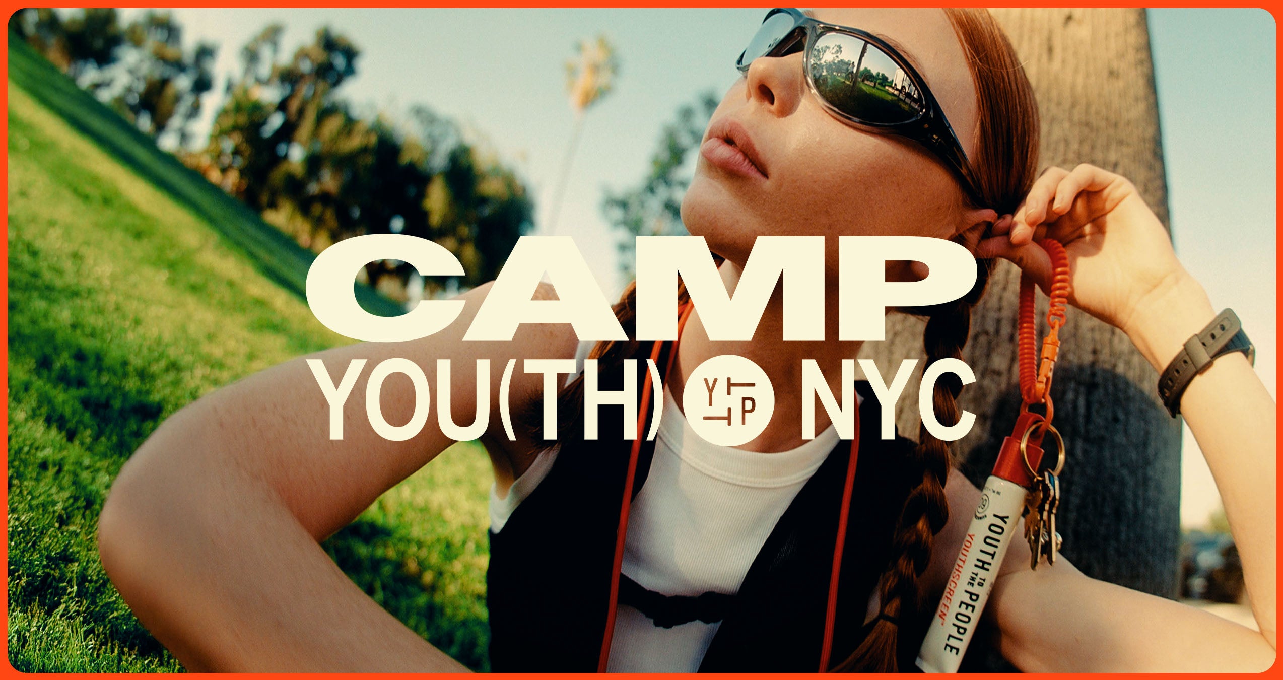
Youth To The People Camp Youth NYC
Youth To The People’s Camp Youth NYC was an immersive brand experience produced by Kin Studios, for which Hayda Studios was commissioned to design a range of visual assets across branding, environmental applications, and print. The work required translating Youth To The People’s established brand into a cohesive, physical environment.
Branding and Environmental Design for Youth To The People
Our work with Youth To The People for Camp Youth NYC focused on creating a cohesive brand expression that extended beyond digital touchpoints and into a fully realized physical experience.
Youth To The People is known for its commitment to community, sustainability, and science-backed skincare. Camp Youth NYC was conceived as a space where those values could be felt—not just communicated. The challenge was to design an environment that felt immersive, intentional, and aligned with the brand’s identity while remaining flexible across multiple formats.
Brand Identity and Creative Direction
The project began with establishing a clear creative direction that honored Youth To The People’s existing brand system while adapting it for a live, experiential setting. Visual decisions were guided by clarity, energy, and approachability, ensuring the space felt welcoming rather than overly branded.
Typography, color usage, and layout systems were developed to scale across signage, printed materials, and environmental applications without losing cohesion. The goal was to create a visual language that felt consistent yet dynamic—capable of supporting storytelling, wayfinding, and engagement.
Environmental Branding and Art Direction
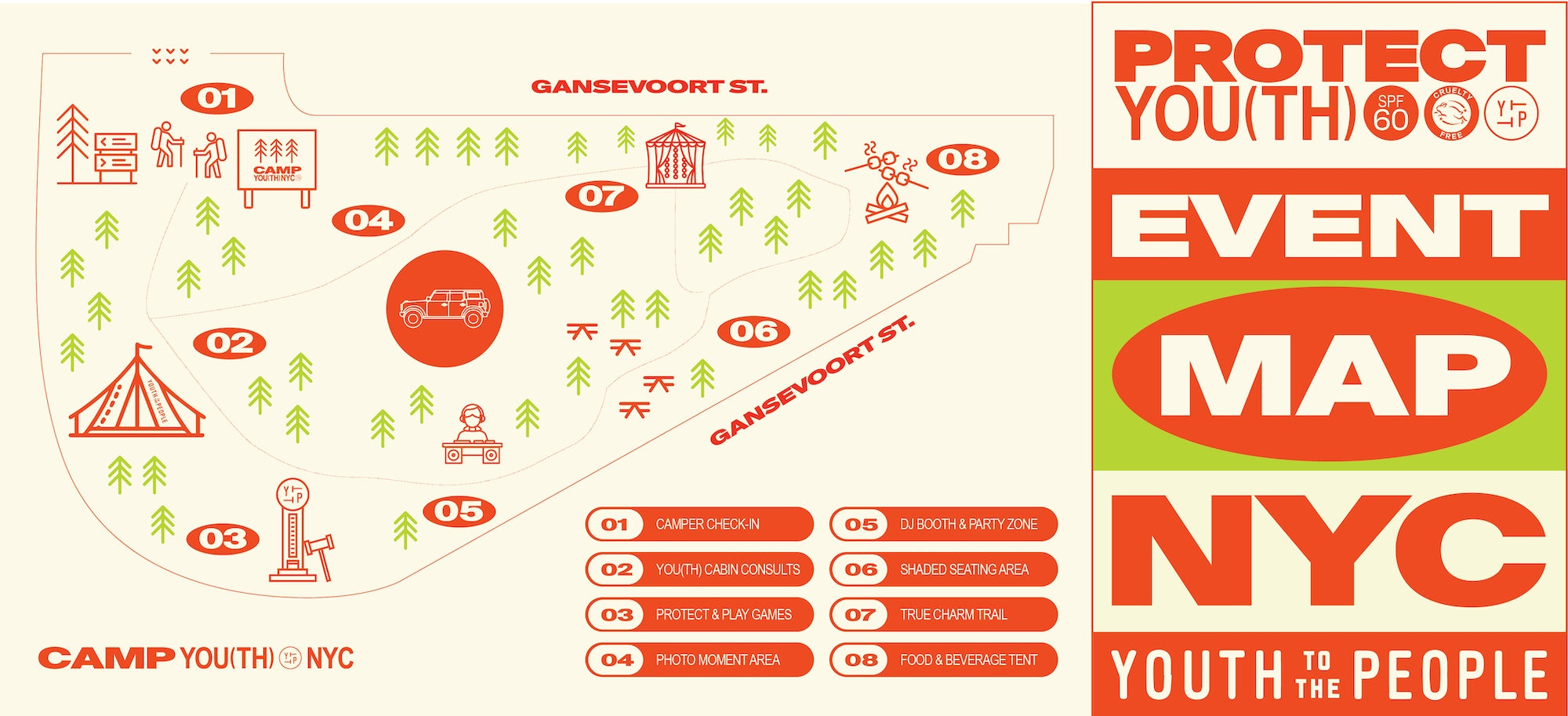
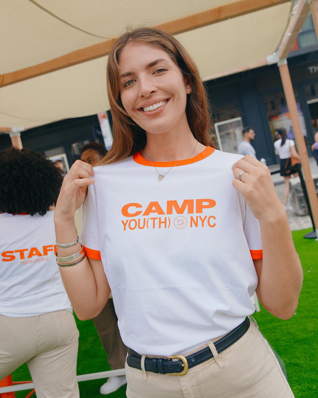
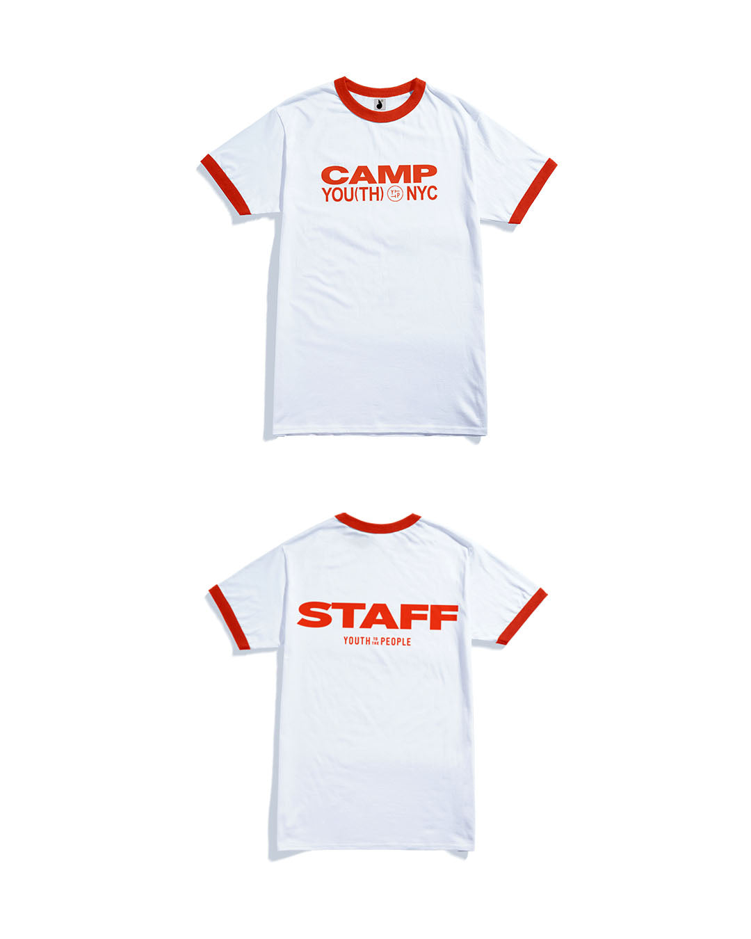
Environmental branding played a central role in Camp Youth NYC. The space needed to function as both an event environment and a visual extension of the Youth To The People brand.
Art direction focused on translating digital-first branding into tactile materials and spatial design. Every element—from large-format graphics to small printed details—was considered as part of a larger narrative. The result was an environment that encouraged exploration while reinforcing brand values through subtle, intentional design.
Graphic Design, Print, and Packaging
Graphic design and print collateral were developed to support the overall experience, including signage, printed assets, and custom packaging elements. These materials served both functional and storytelling purposes, guiding visitors while reinforcing the brand’s commitment to quality and sustainability.
Packaging design extended the experience beyond the event itself, allowing guests to take a tangible piece of Camp Youth NYC with them. Each element was designed to feel cohesive within the broader system while standing on its own.
A Cohesive Experiential System
Camp Youth NYC required more than individual deliverables—it required a system. By aligning branding, environmental design, and print execution, the project created a unified experience that felt distinctly Youth To The People.
If you’d like to explore how this approach translates across different scales and industries, you can view additional work on our Projects page.
Youth To The People –– Camp You(th) NYC
We brought Camp You(th) to the People to life last month in the heart of NYC to celebrate the brand’s first-ever SPF launch - Youthscreen SPF 60.
DELIVERABLES
Branding + Identity
Art Direction
Environmental Design
Graphic + Print Design
CREDITS
Creative & Event Production by kin.work

Charm Bar by True Ascend

Charm Bar Form

Charm Bar by True Ascend


view other projects